
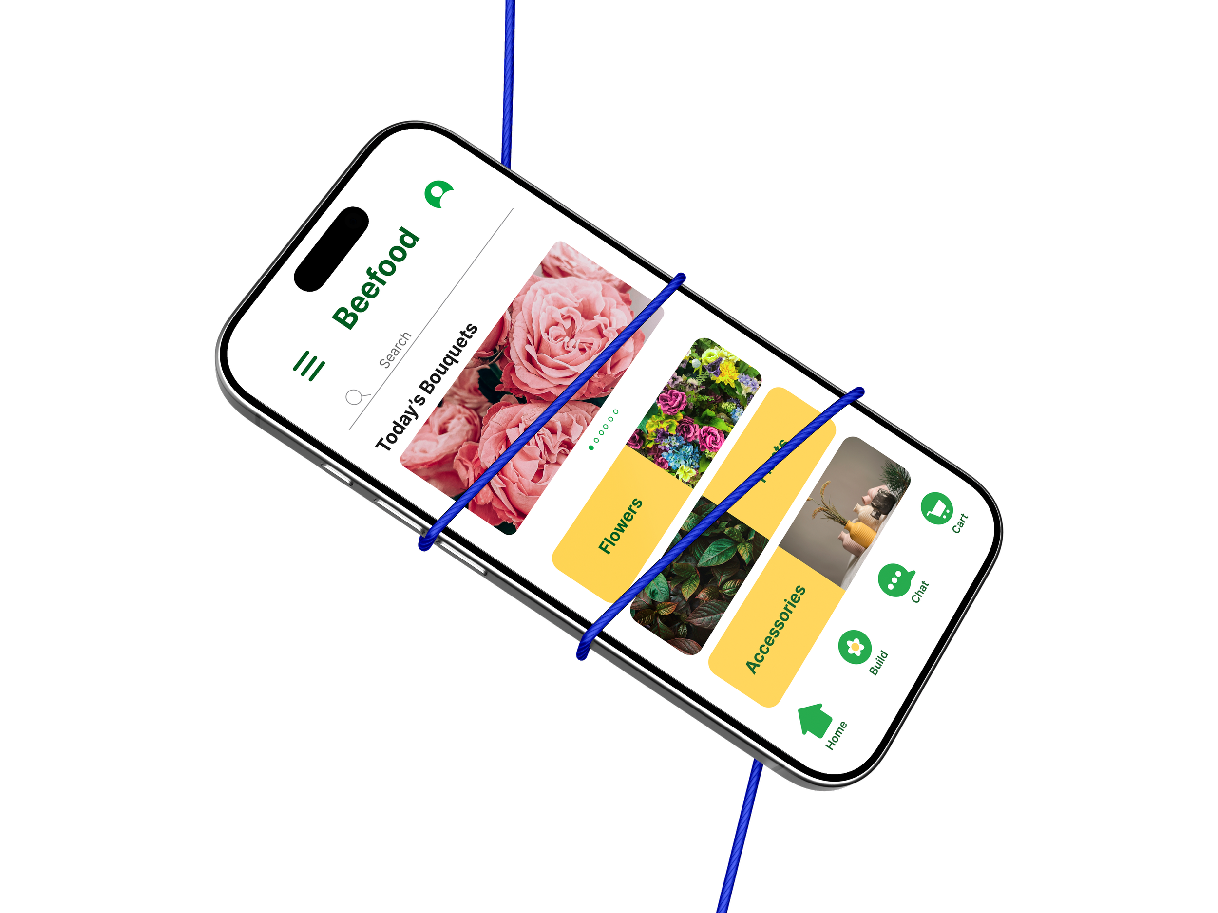
Beefood
Bouquet customization that doesn't feel like a chore.
UX Researcher · UI/UX Designer · Brand Designer | March – September 2024 |
Figma, User Interviews · Journey Mapping · Personas · Wireframing · Usability Testing · Prototyping
Overview
Beefood is a mobile app for buying flowers and plants online, built around one idea: letting people customize a bouquet instead of picking from a fixed catalog. I led the project end to end, covering research, wireframes, visual design, and two rounds of usability testing, and used what I learned to rebuild the interface around what people actually got stuck on, not what looked good on a moodboard.
The Problem
Across the flower and plant apps I looked at, Flowwow, Naturkenva, Interflora, and Planta, the same pattern kept showing up: invasive pop-ups, a catalog to pick from instead of a bouquet to build, and no real thought given to who's using the app.
The Goal
Design a bouquet-building flow simple enough that customizing becomes the reason someone picks Beefood over a generic flower shop app, not an extra step they have to fight through before they can even get started.
Research & Discovery
Before sketching anything, I ran a competitive audit of four apps in the sector: Flowwow, Naturkenva, Interflora, and Planta. Comparing their flows side by side surfaced four main pain points:

PAIN POINT
Customers are treated as either very specific or very generic, with nobody designing for the middle
PAIN POINT
None of them design for people with special needs or a wide age range
PAIN POINT
None of them let you fully personalize the bouquet or plant you're buying, only choose from a fixed catalog
PAIN POINT
None of them account for people who'd rather pay in cash than by card
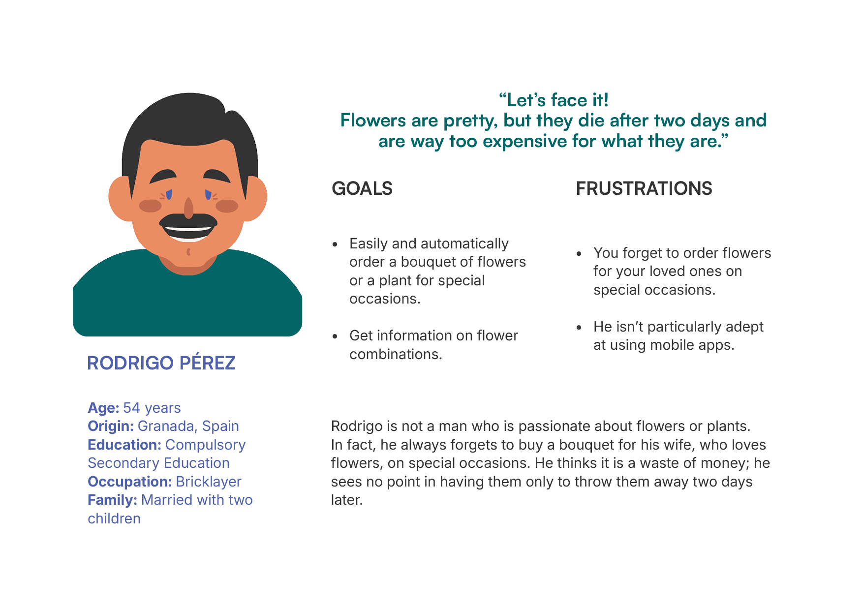
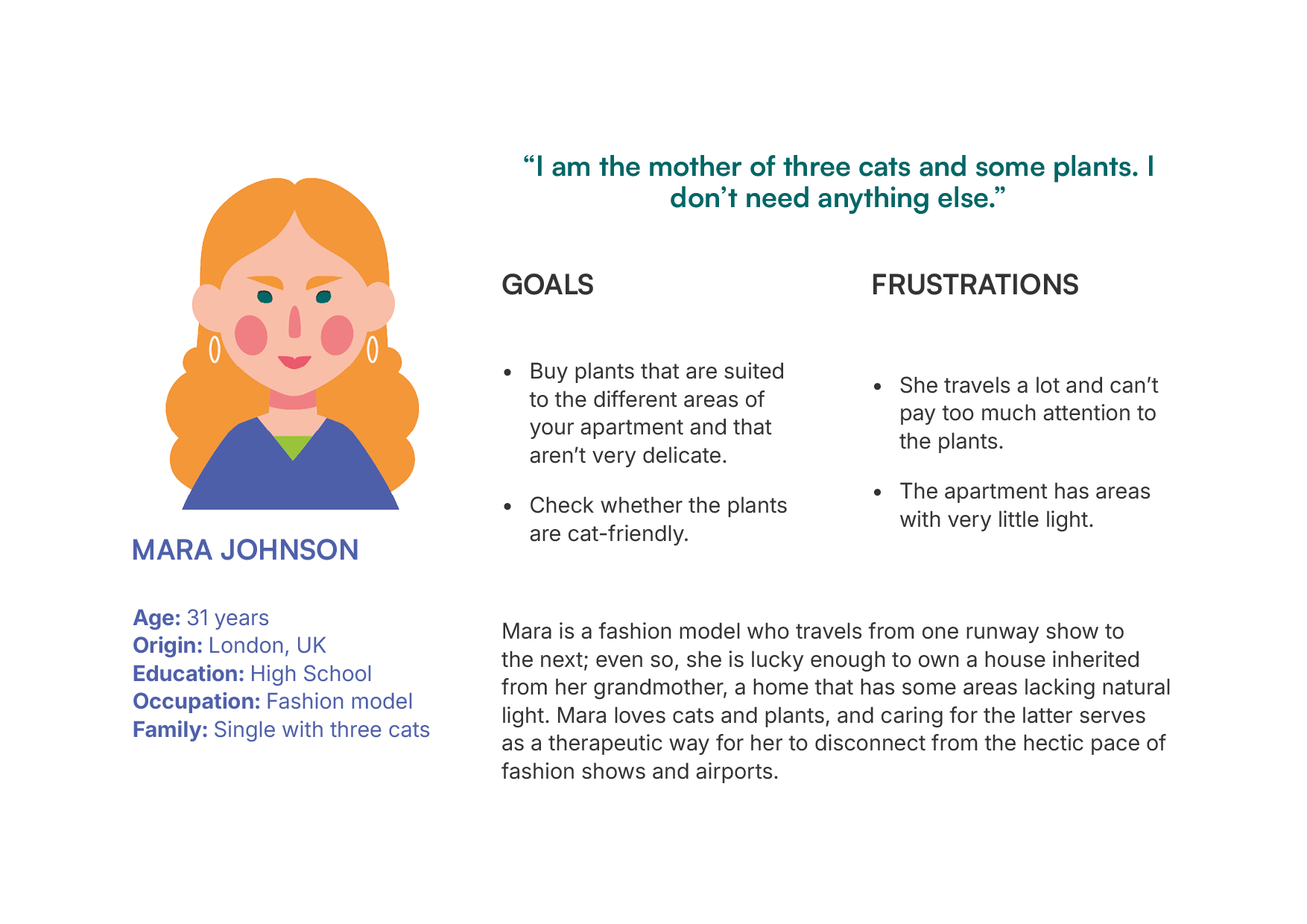
Meet the User
From insight to decisions
To understand where they actually got stuck, I walked through both of their journeys step by step, from installing the app to getting the flowers delivered, paying attention to how each moment felt, not just what each screen did.
What I found is that Rodrigo and Mara needed almost opposite things from the same experience: he wanted to move fast, she wanted to feel sure. That difference shaped three decisions:

Choosing shouldn't require expertise.
Rodrigo gets stuck because he doesn't know flowers. Mara gets stuck because there's too much to compare across every florist in town. Different reasons, same outcome: they hesitate.
So I built the flow around removing that expertise requirement entirely;
a fast, guided path for people who just want it handled, with everything in one place so nobody has to hop between apps to compare.
Price and time pressure shouldn't stack.
Rodrigo doesn't know what a bouquet actually costs until it's too late to change his mind. Mara feels rushed the moment she has to commit to paying.
Neither of those is really about money; it's about feeling in control of the decision. So the price updates live as the bouquet is built, and nothing pushes someone to decide faster than they want to.
The relationship doesn't end at delivery.
Rodrigo forgets to reorder for the next occasion. Mara needs plant care that fits her specific home, not generic instructions. Both point to the same gap: the app treats delivery as the finish line, when it's really the start of keeping something alive.
So care guidance and delivery scheduling live inside the app, not as an afterthought.
Exploring the design
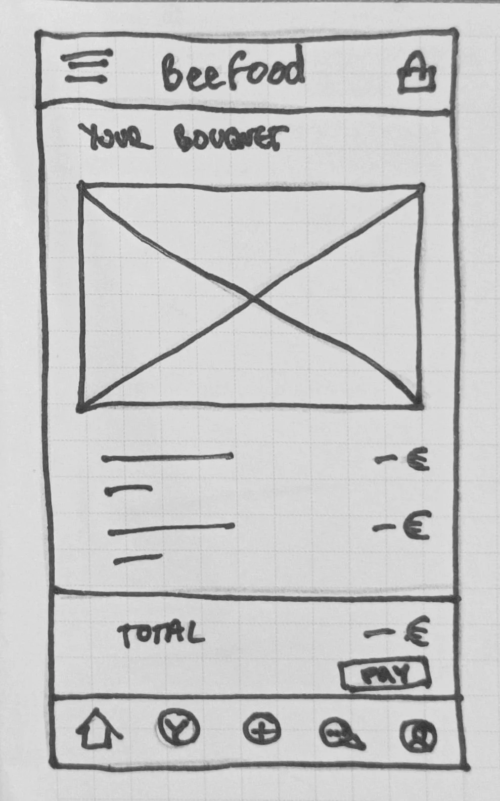
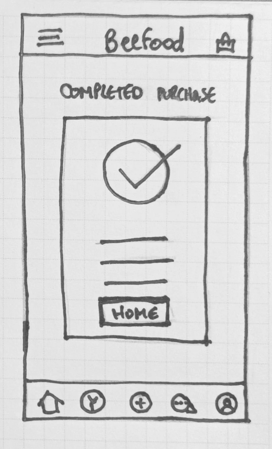
I started on paper: rough, but enough to get the structure down before touching Figma.
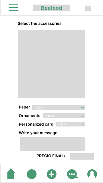
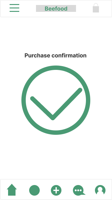
Digital wireframes came next. I designed the icons myself, aiming for something simple enough to read at a glance. The shopping cart took the most iteration. Organizing the interactions cleanly turned out to be harder than expected, so I spent most of the low-fidelity stage on the bouquet customization flow specifically, since that was the core of the project.
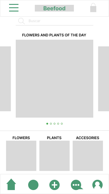
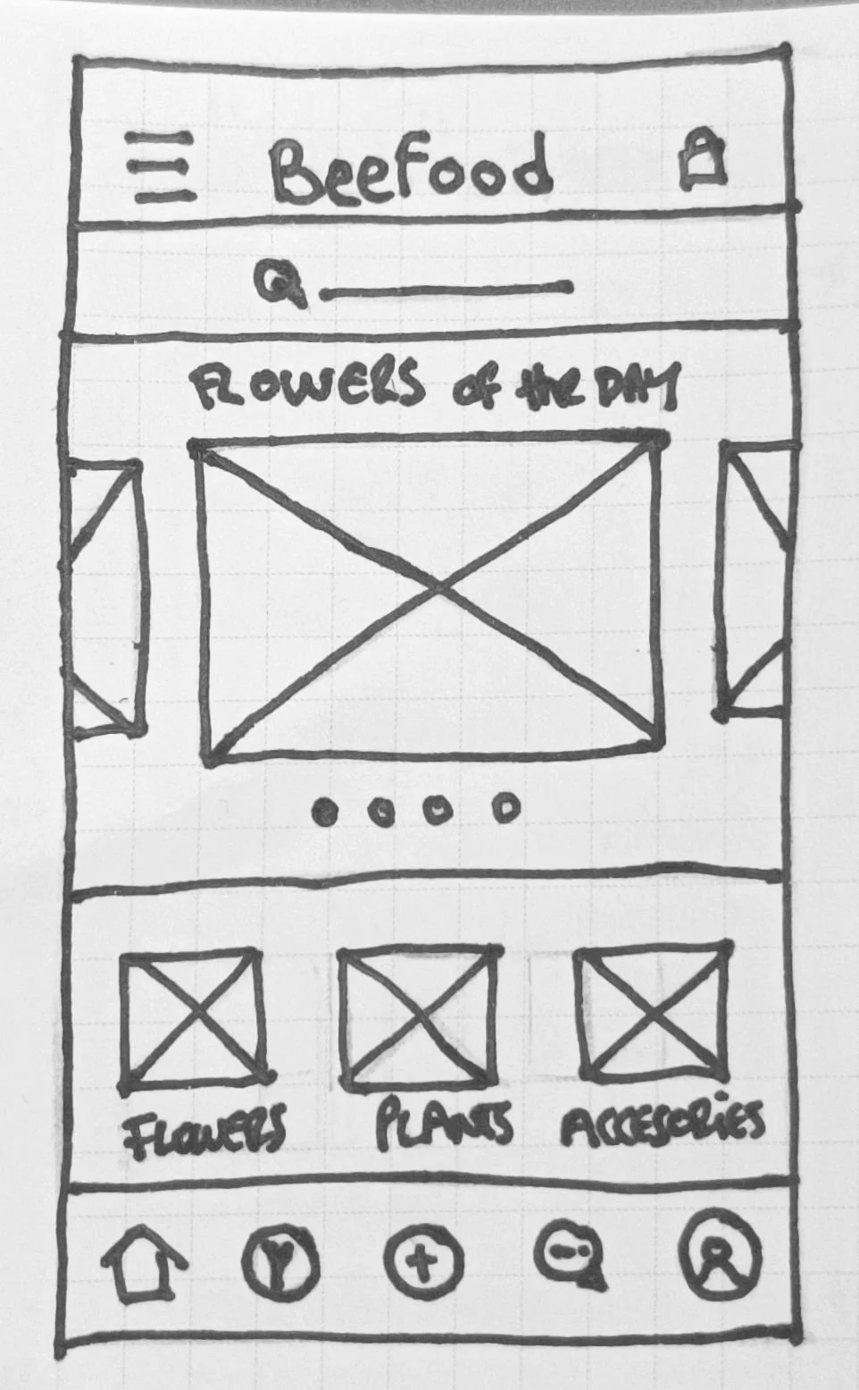
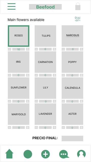
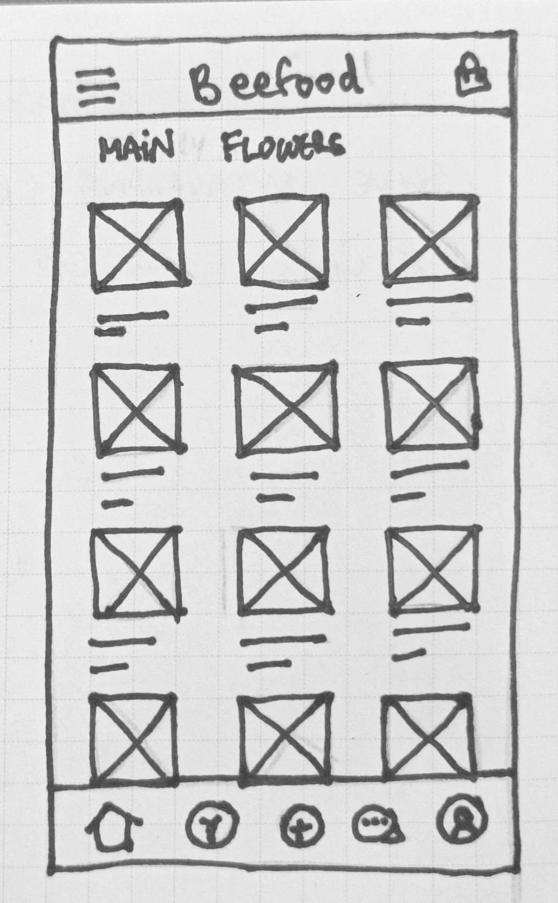
Testing & Iteration
I tested with 5 people, ages 16 to 60, remotely, across two rounds. Nobody failed a task, but 3 of the 5 struggled with the one that matters most: starting a bouquet from scratch.
Round 1 pointed to three consistent issues:
Icons were hard to identify and locate. One participant put it plainly: "I can't connect the plus icon with building a bouquet from scratch."
Colors and buttons needed more contrast and size. One participant couldn't find the search bar because of low contrast, another kept missing the add-to-cart button because the touch target was too small.
People wanted to pick a specific delivery date and time. A calendar came up unprompted as something missing.
After revising, round 2 confirmed it worked: people found icons faster and read colors more clearly. What they asked for next was a more complete customization flow: paper and decoration options for the bouquet.

Final design & Visual system
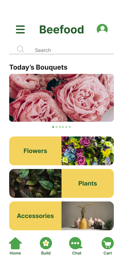
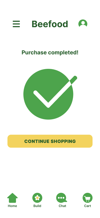
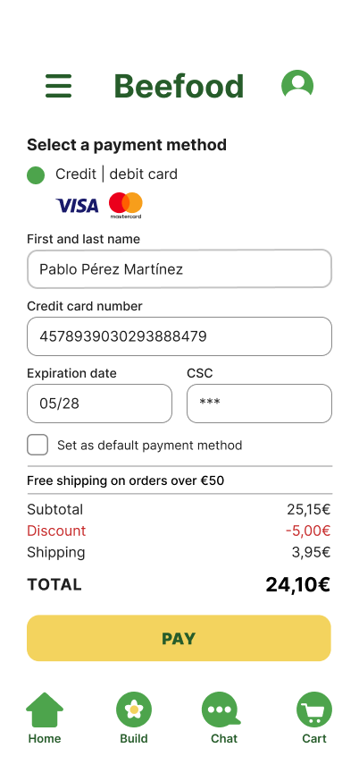
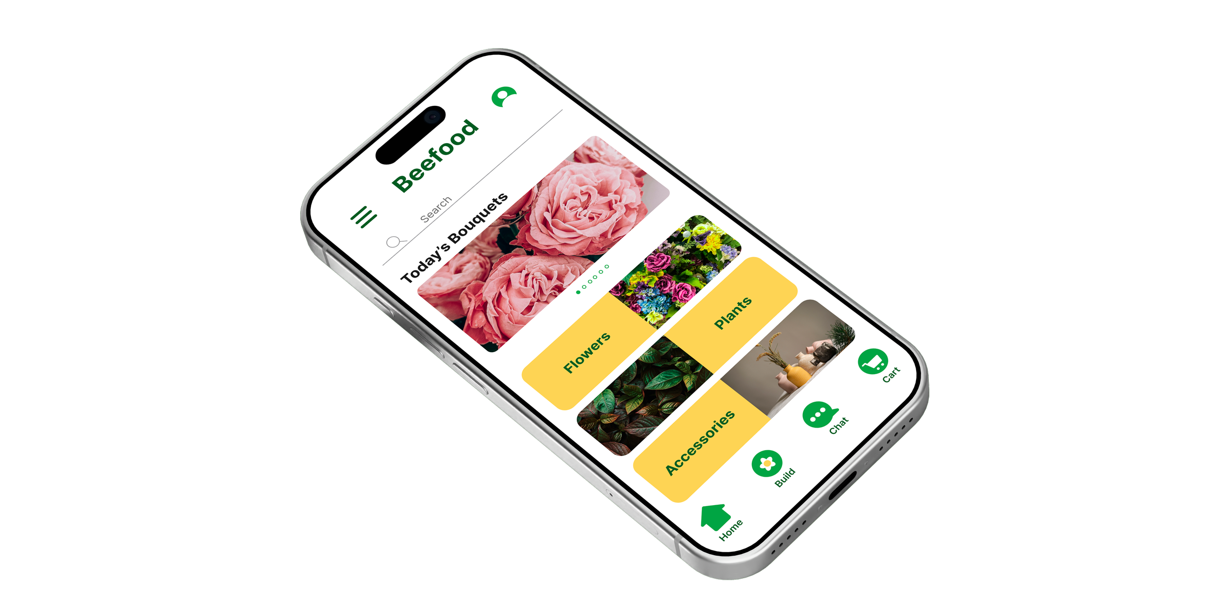
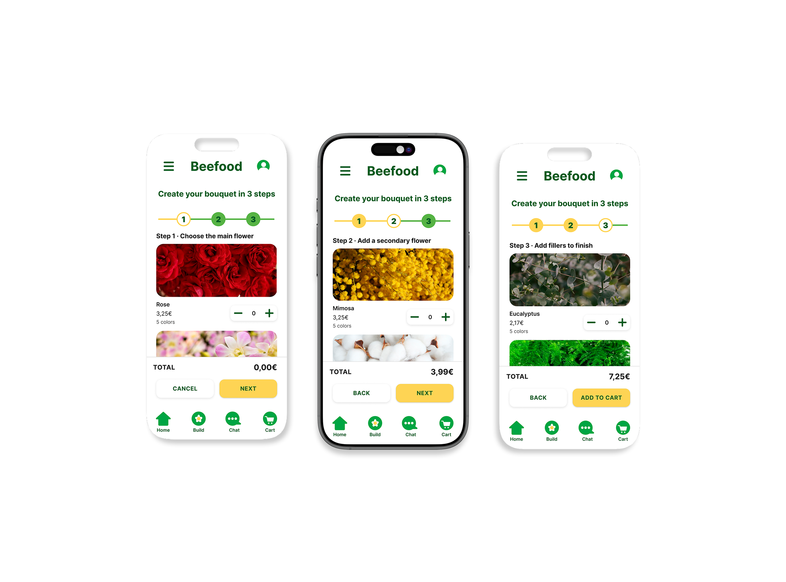
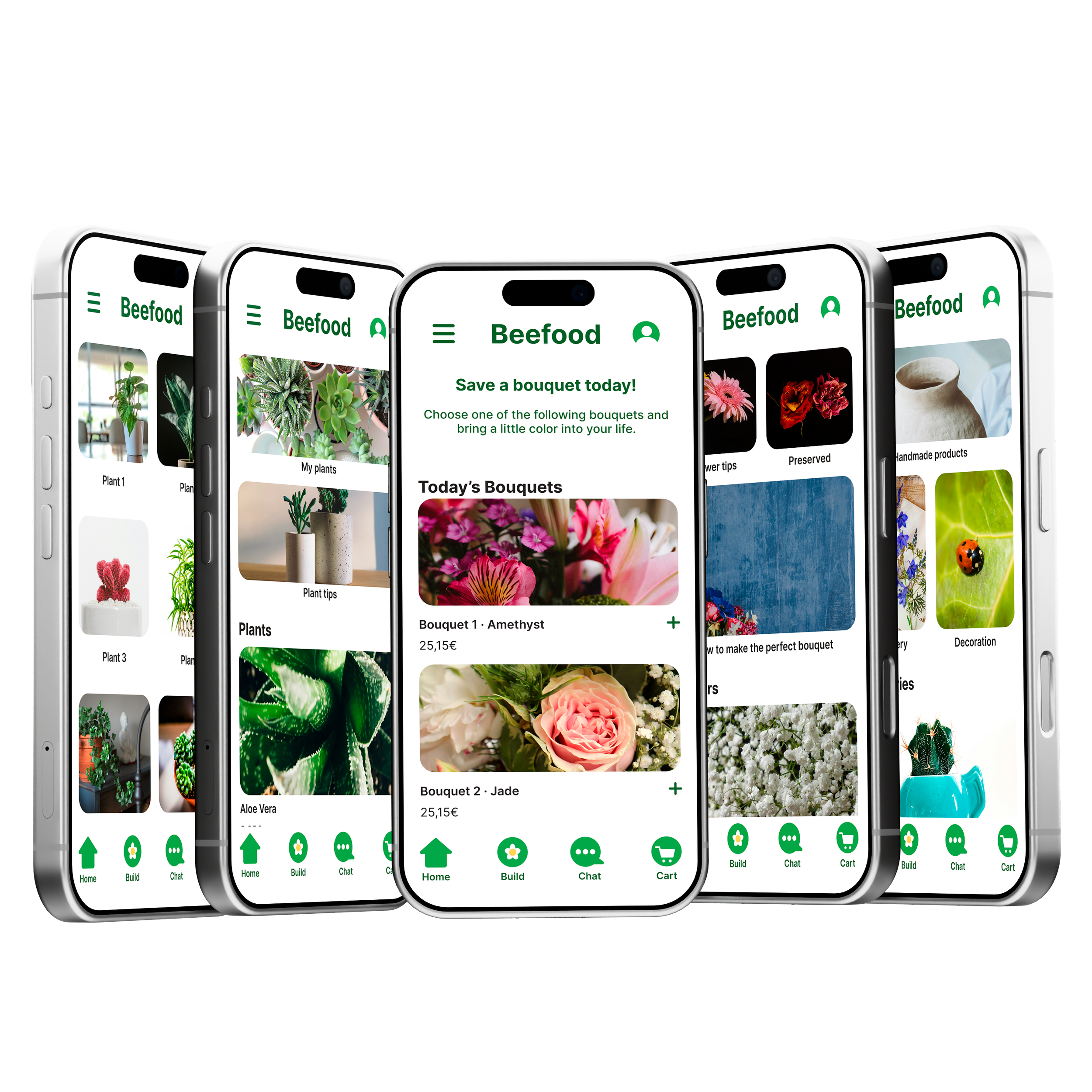
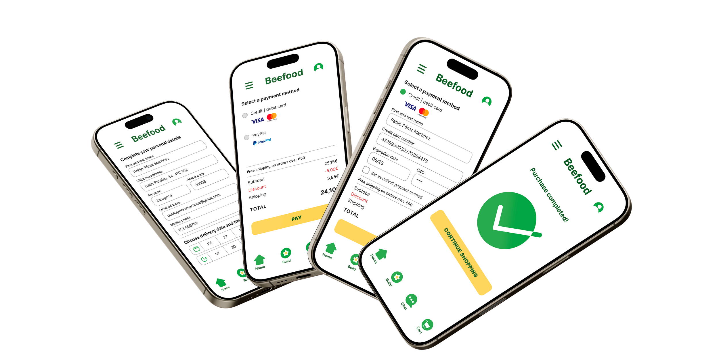
The final palette is built around yellow as the accent color, with rounded edges throughout to keep the app feeling organic rather than transactional. High contrast wasn't just an aesthetic choice: it helps people with vision difficulties read the interface, and the interaction animations were built with that in mind rather than as decoration.
A second look
Round 1 of testing had already flagged small buttons and low contrast, and I thought I'd fixed them. Then a senior designer reviewed the app and found them again, right on the checkout: the one screen where Mara needs to feel sure and Rodrigo just wants to be done.
So I went back through every screen, not just that one. Text got bigger, buttons got easier to hit, form fields got a clear outline instead of a grey box, and the navigation finally got labels, the thing round 1 had asked for in the first place. None of it changes what Beefood does. It changes how easy it is to actually do it.
Before
After
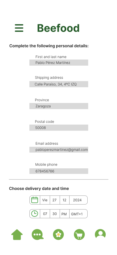
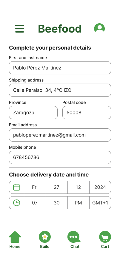
Bigger fields, bigger text, and date and time pickers you can actually tap.
Before
After
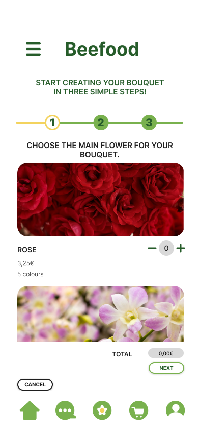
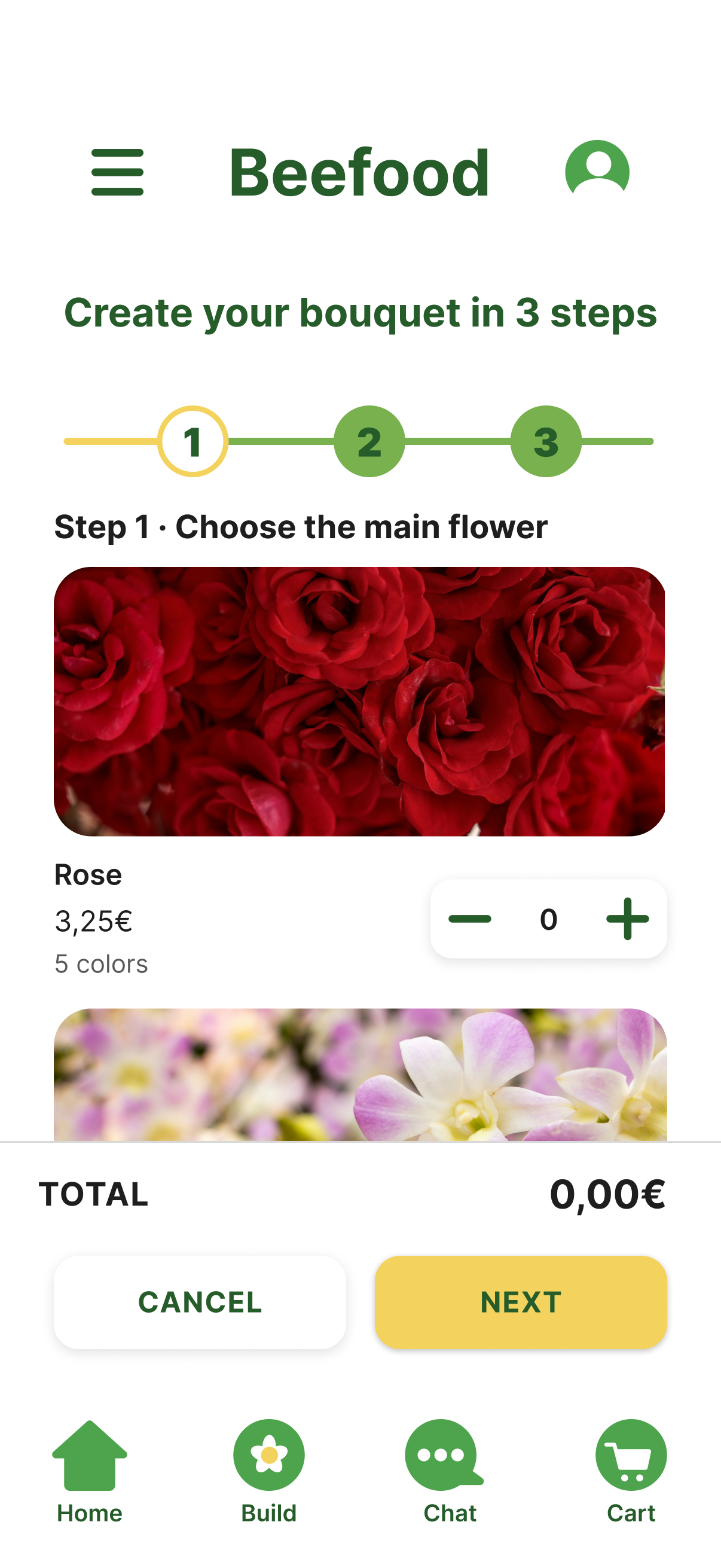
One step at a time, easier quantity controls, and the total always in view.
Before
After
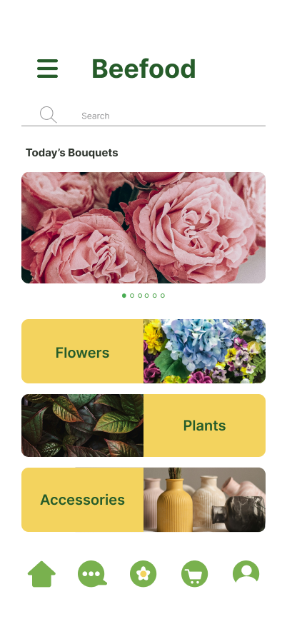
The same yellow category cards, now full width and easier to tap, and a navigation bar that says what each icon does.
Outcome & Reflection
The research made the business case obvious. For someone like Rodrigo, this app isn't really selling flowers: it's closing the gap between remembering an occasion and doing something about it. That's the difference between someone finishing a purchase and abandoning the app out of indecision.
If I kept working on this, I'd add a message/note option to the builder, run another round of testing, and build out the plant-care reminders that came up in research but never made it past the idea stage.
“The bouquet builder taught me that removing decisions is often better design than adding options. Even a five-step purchase can feel effortless if the friction is gone.”