
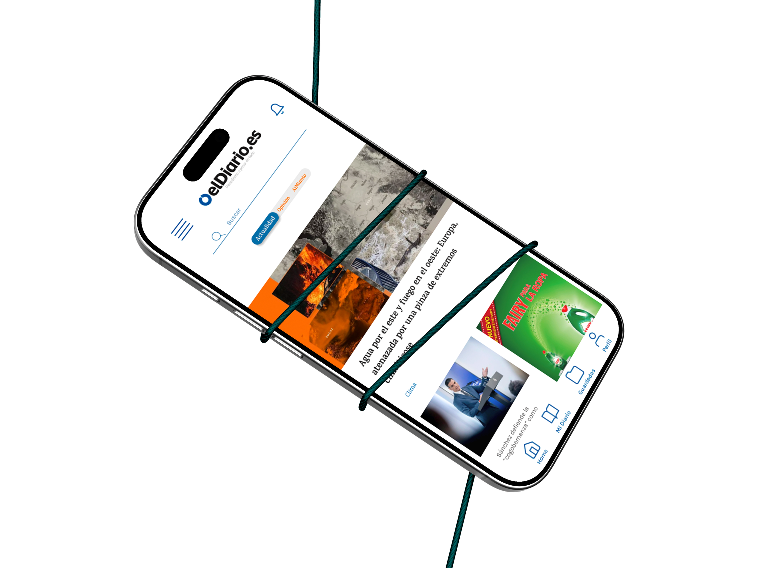
elDiario.es (redesign)
A newspaper redesign that trades invasive ads for a reader people actually want to open.
UX/UI Designer · Brand | Oct - Dec 2024 | Figma, Competitive Audit, Heuristic Evaluation, Wireframing, Prototyping
Overview
elDiario.es is a Spanish news outlet whose print and digital editions were both struggling to reach a younger audience, weighed down by invasive advertising and a dated interface, the kind of friction that costs a media brand both trust and subscriber revenue. This project redesigns the website and app around a simpler, calmer reading experience, informed by a competitive audit and a full heuristic evaluation of the existing site.
The Problem
Neither the print edition of elDiario.es nor its website was reaching younger readers. Ads were so invasive they overwhelmed the news itself, undermining the outlet's credibility instead of funding it.
The Goal
Redesign elDiario.es to earn a younger audience without losing the readers who already trust it: a cleaner interface, advertising that funds the outlet instead of driving readers away, and a clearer hierarchy from homepage to article.
Research & Discovery
I ran a competitive audit against four other outlets, El Mundo, ABC, El País, and Euro News, and a full heuristic evaluation of elDiario.es itself. El País and Euro News scored consistently well across navigation and content hierarchy, giving a clear bar to design against. The heuristic evaluation surfaced problems benchmarking alone wouldn't have caught:

PAIN POINT
Navigation links inside a category redirect out to an external page instead of staying on the site
PAIN POINT
Subscribing is a single click with no confirmation step, an easy accidental commitment

PAIN POINT
Error and confirmation messages use inconsistent styles across the site, so they don't read as one system

PAIN POINT
The homepage needs heavy scrolling to reach anything beyond the top story, burying 'last minute' news under ad blocks.
From insight to decisions
The heuristic evaluation didn't just flag what was wrong, it pointed directly at what to change. Three decisions came out of it:

Ads shouldn't compete with the reader.
The original homepage buried the logo and the actual news under invasive ads in the header and sidebars. So the redesign moves to a minimalist, clean layout where advertising sits inside the flow instead of fighting for the same space as the story.
Time-sensitive news needs to be seen, not buried.
On the original site, the "last minute" column, arguably the most valuable real estate for a news outlet, sat low on the page, under multiple ad blocks and a long scroll. So it moves to the top of the homepage, visible without scrolling.

The relationship doesn't end at delivery.
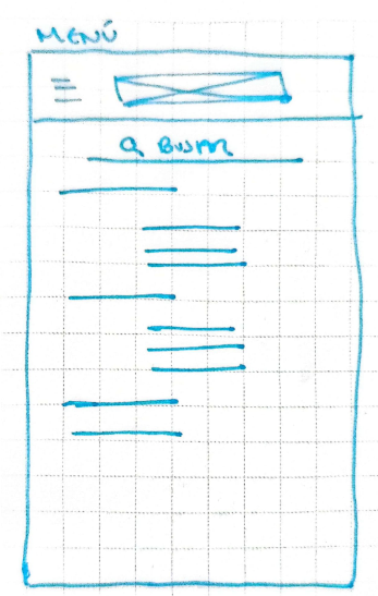
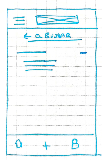
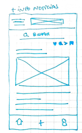
The original homepage packed in too many categories, forcing readers to scroll through content that wasn't relevant just to find what was. So the redesign adds a visible search bar and a full category menu in the top corner, letting readers jump straight to what they want.
Exploring the design
The style guide is built on a four-column grid and keeps elDiario's original blue, so returning readers don't feel like they landed on a different outlet, paired with a second blue, two neutral greys, and an orange accent aimed at feeling more current and energetic. Typography splits between Karma, a serif, and Karla, a sans-serif.
Working through the actual type and color styles in Figma at this scale was the hardest part. I ended up with more variations than the grid really needed. That's the first thing I'd tighten if I revisited this project.


Testing & Iteration
This project stopped at high-fidelity prototype, so there's no usability data yet. If I picked it back up, here's where I'd start:
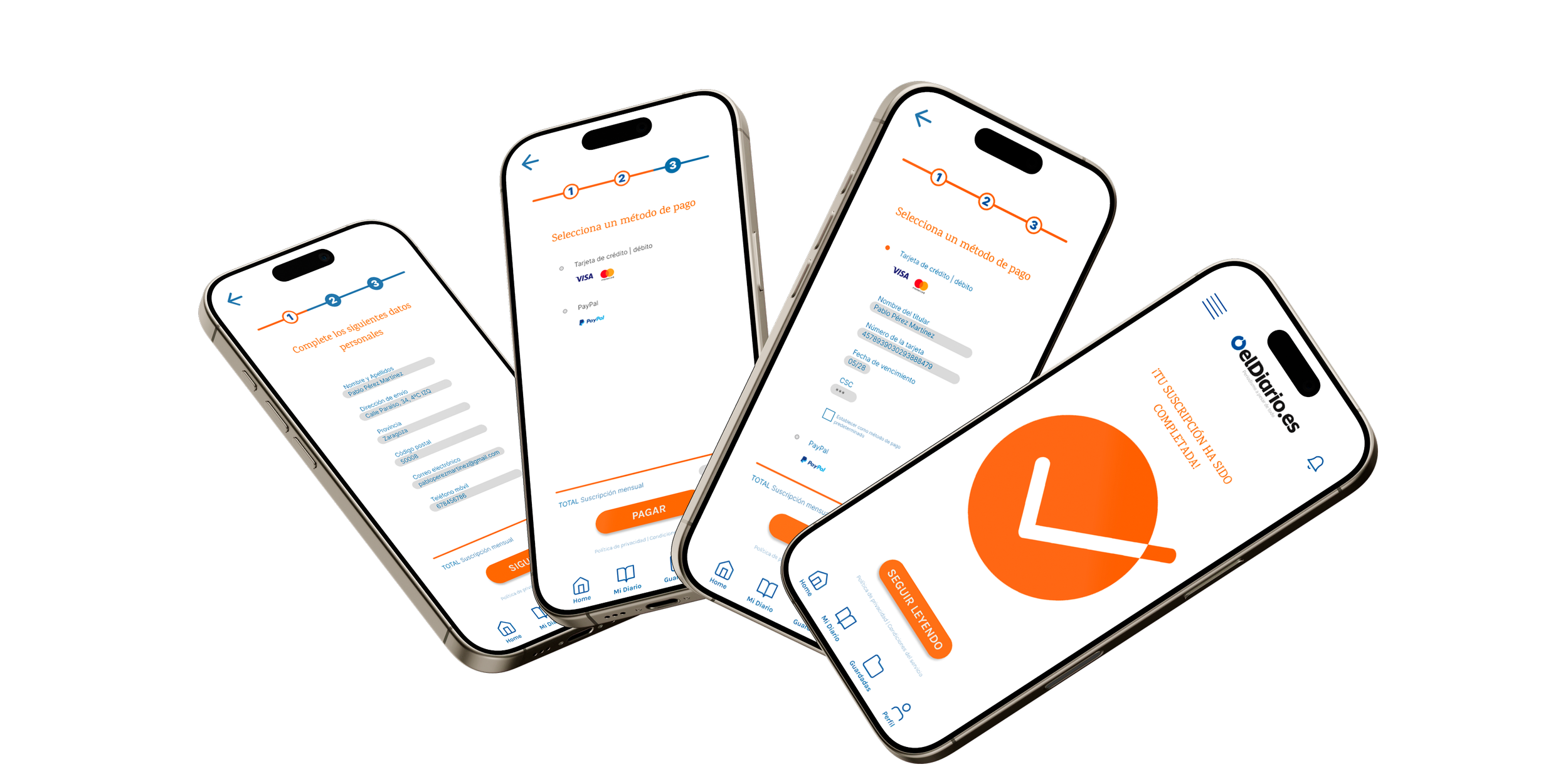
Priority one would be the subscription flow, since it's the one screen tied directly to revenue, and it's also the one flagged as a risk in the heuristic evaluation: a single tap with no confirmation step. I'd run a moderated test with 5 to 8 people, a mix of current subscribers and non-subscribers, and watch specifically for accidental commits.
Priority two would be homepage hierarchy: how long it takes someone to find a specific story versus the "last minute" section, since that gap is the difference between a reader who stays and one who bounces to a competitor.
I'd also unmoderated-test the navigation redirect issue, links that send readers to an external page instead of keeping them on the site, since that's the kind of friction people rarely comment on but quietly act on by closing the tab.
Final design & Visual system
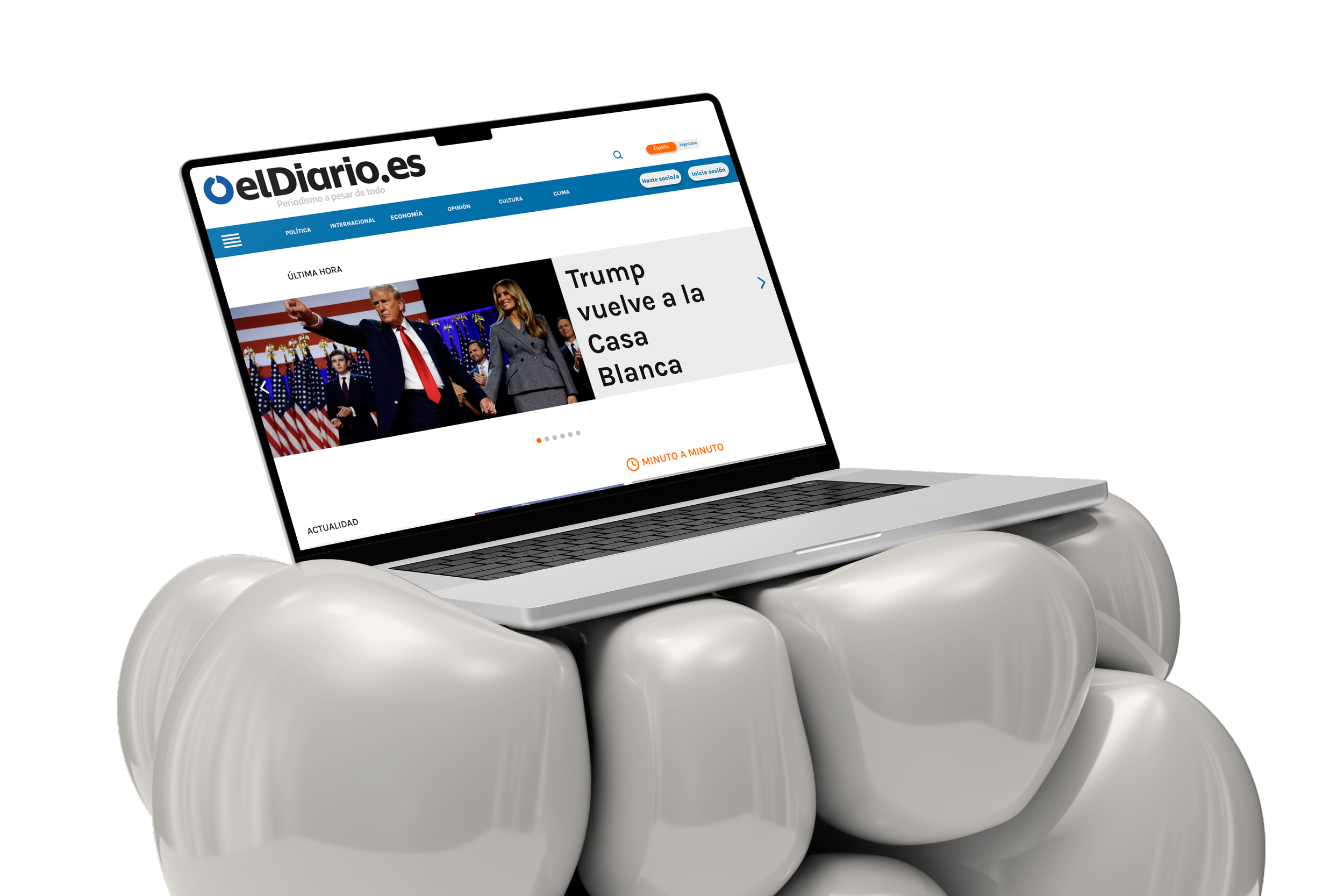
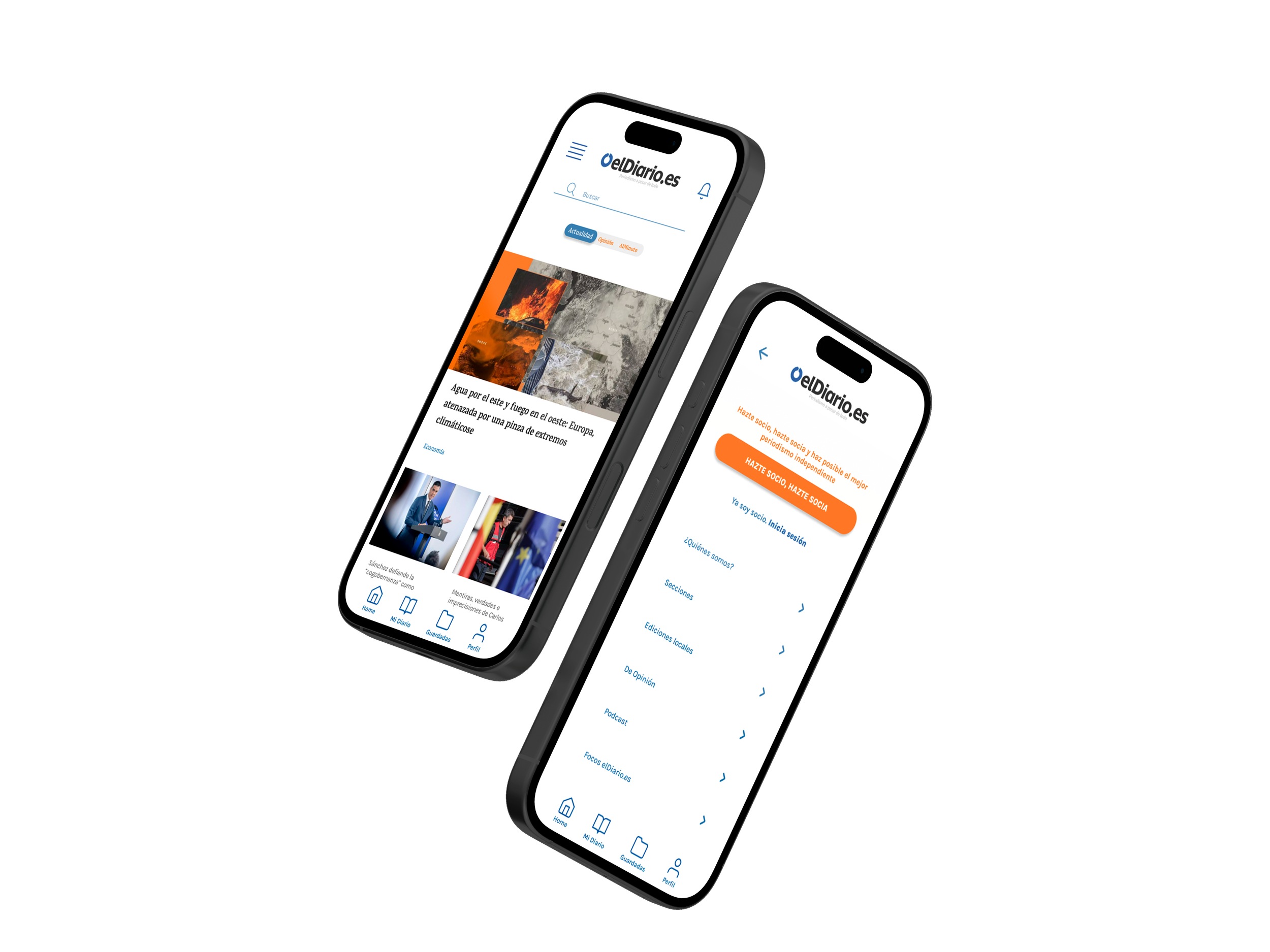
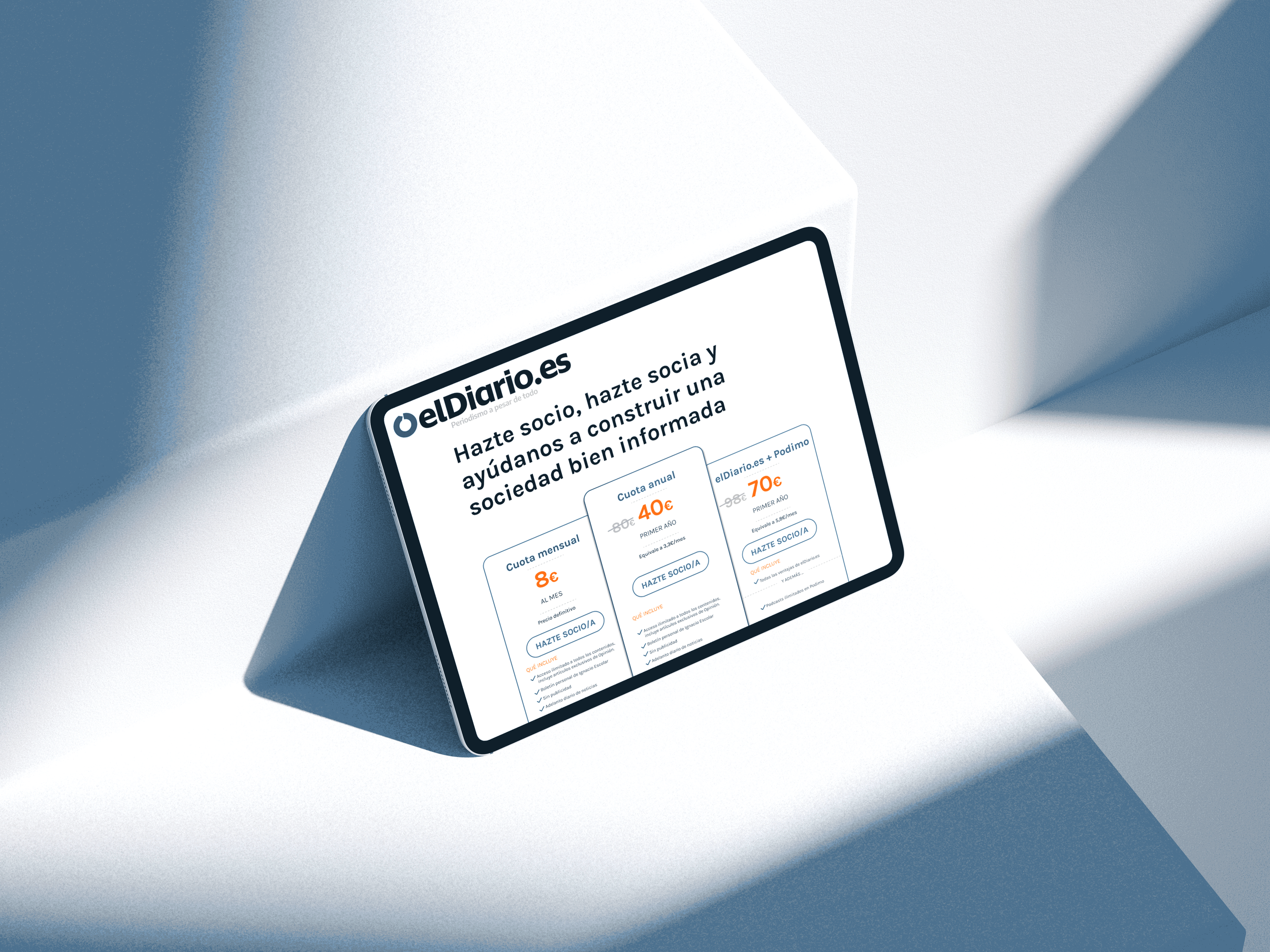
The final design keeps elDiario's blue as the anchor, with a second blue, two neutral greys, and an orange accent carrying the more current feel the redesign was aiming for. High-fidelity mockups cover the homepage, an article page, and the subscription flow, across both desktop and mobile.
Outcome & Reflection
The heuristic evaluation made the business case obvious before a single user test was run. A subscription button with no confirmation step and a logo that disappears on scroll aren't just visual issues, they're the kind of friction that costs a media outlet both trust and revenue. If this shipped, the two numbers I'd watch first are subscription completion rate and time-to-first-story from the homepage, since both map directly to the goal: keep the readers who already trust elDiario.es, and give younger readers a reason to stay.
“Redesigning a media brand isn't about looking newer, it's about getting out of the way of the story.”