
SNS
(National Health System)
One accessible app and brand identity for a public health system currently split across 17 different regional versions of itself.
UX Researcher · Product Designer | Jan - Jun 2026 | Figma, Design Thinking (Empathize, Define, Ideate, Prototype), User Personas, Empathy Mapping, User Journey Mapping, Competitive Audit, Information Architecture, Prototyping
Overview
Spain's National Health System (SNS) is consistently ranked among the best public healthcare systems in Europe, but its digital experience doesn't reflect that quality.
The system is decentralized across 17 autonomous communities, each running its own apps and interfaces with no shared identity or interoperability between them.
This project proposes a unified brand identity and companion mobile app for the SNS, using Design Thinking to keep every decision grounded in the patients the current fragmented system serves worst:
people managing their health alone, and specifically women's health, an area consistently underserved by existing tools.
The Problem
Spain's public healthcare system is excellent in practice, but accessing it digitally means navigating a different app and interface depending on which region a patient lives in, with tools that are often inconsistent, inaccessible for older or visually impaired users, and impersonal, in a sector where people are already anxious or overwhelmed.
The Goal
Design one accessible brand identity and companion app for the SNS, built around clarity and a personal tone instead of the generic, clinical default of the sector, giving patients from a 25-year-old juggling irregular periods to a 68-year-old managing his own health for the first time a single, coherent way to interact with public healthcare.
Research & Discovery
I ran a competitive audit of four Spanish health apps, Salud Informa (Aragón), Quirón Salud, Salud Andalucía, and GVA+Salut, across identity, accessibility, and content tone.
The same pattern showed up across nearly all of them:

PAIN POINT
Most lean on the same overused blue and green "sanitary" palette instead of building a distinct, trustworthy identity

PAIN POINT
Text sizes are frequently too small for users with visual impairments, a basic accessibility failure in a sector meant to serve everyone

PAIN POINT
None of the four apps offers an integrated calendar, despite being central to managing your own health

PAIN POINT
The tone across the sector is impersonal and clinical, in a context where patients are often anxious or overwhelmed
Meet the User


From insight to decisions
Four decisions came directly out of what Lucía and José's insights and How Might We questions pointed to:

A single, guided path instead of a maze of choices.
José's real barrier wasn't technology, it was losing the person who used to translate the system for him. So the app runs on one clear structure: Dashboard, Salud Mujer, Citas Médicas, Perfil Salud, and Ajustes.

Registration asks for the minimum, not the maximum.
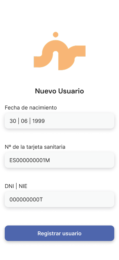
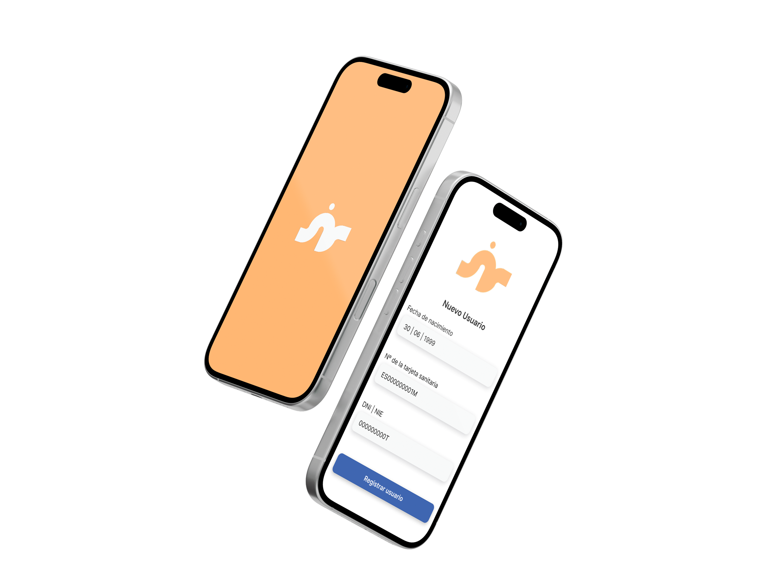
Both personas' insights pointed to friction as the reason people abandon health apps. So onboarding asks for three fields, birth date, health card number, and ID, before dropping straight into a personalized dashboard.

Women's health gets its own space, not a generic form.
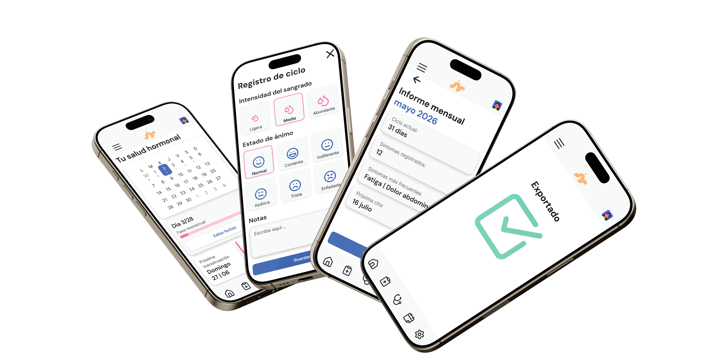
Lucía's insight was that existing apps treat menstrual health like a footnote. So Salud Mujer became a dedicated section with its own accent color, tracking cycle, symptoms, and mood together.
Every screen leads with what matters today.
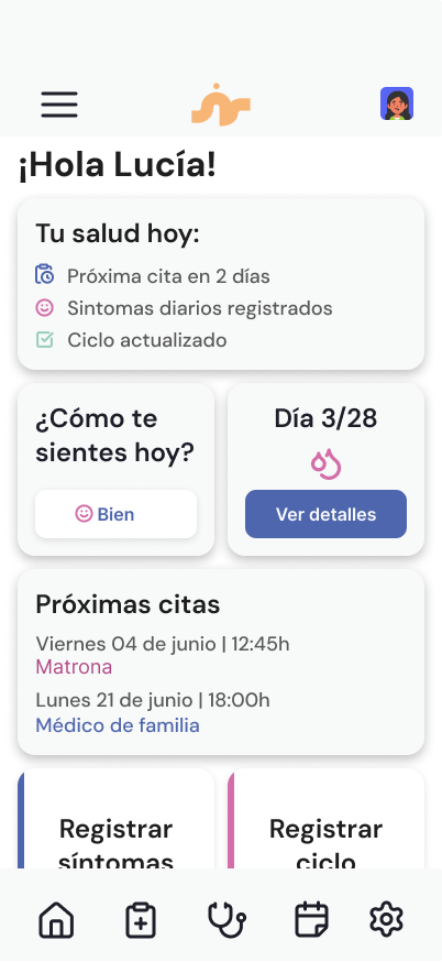
Lucía's core frustration was losing continuity between consultations. So the dashboard opens on "Tu salud hoy," surfacing the next appointment, today's symptoms, and cycle status before anything else.
Exploring the design
The interface runs on a four-column grid, organized through a Bento-box card system that groups related information into clear, self-contained modules, chosen specifically to reduce cognitive load in a sector where the content itself is often already stressful to process.
Typography splits between DM Sans for headings and Inter for body text, both chosen for screen legibility over decorative flourish.
The color palette carries functional meaning as much as brand meaning: a blue for trust and every primary action, a dedicated pink reserved for women's health so that part of the system reads as its own space, an orange kept for the brand itself, and a green for confirmations, without leaning on the overused "sanitary" green flagged in the competitive audit.
Lucía and José's user flows were mapped separately before a single screen was designed, since their two paths through the app, one built around cycle tracking, one around appointment management, needed to work independently before they could share a system.
Testing & Iteration
This project worked through Design Thinking's empathize, define, and ideate phases, but stopped short of user testing, a scope decision made given the time available, not an oversight. If I picked it back up, here's where I'd start:
Priority one would be testing onboarding and navigation with users closer to José's profile, older adults or people with limited digital experience, since the entire premise of this project is accessibility, and that claim needs to hold up with the people it's meant to serve, not just against guidelines on paper.
Priority two would be testing the Salud Mujer flow with people closer to Lucía's profile, checking specifically whether cycle and symptom tracking actually reduces the friction she described at her consultations, instead of just moving it into a different app.
I'd also want to validate the five-section information architecture itself with both groups, since it's the structural decision the entire app depends on, and the one thing in this project that was never checked against a real user.
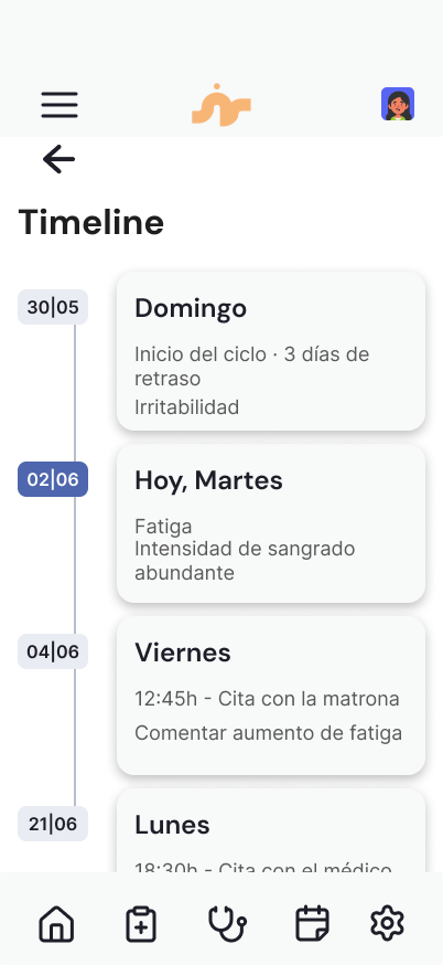
Final design & Visual system
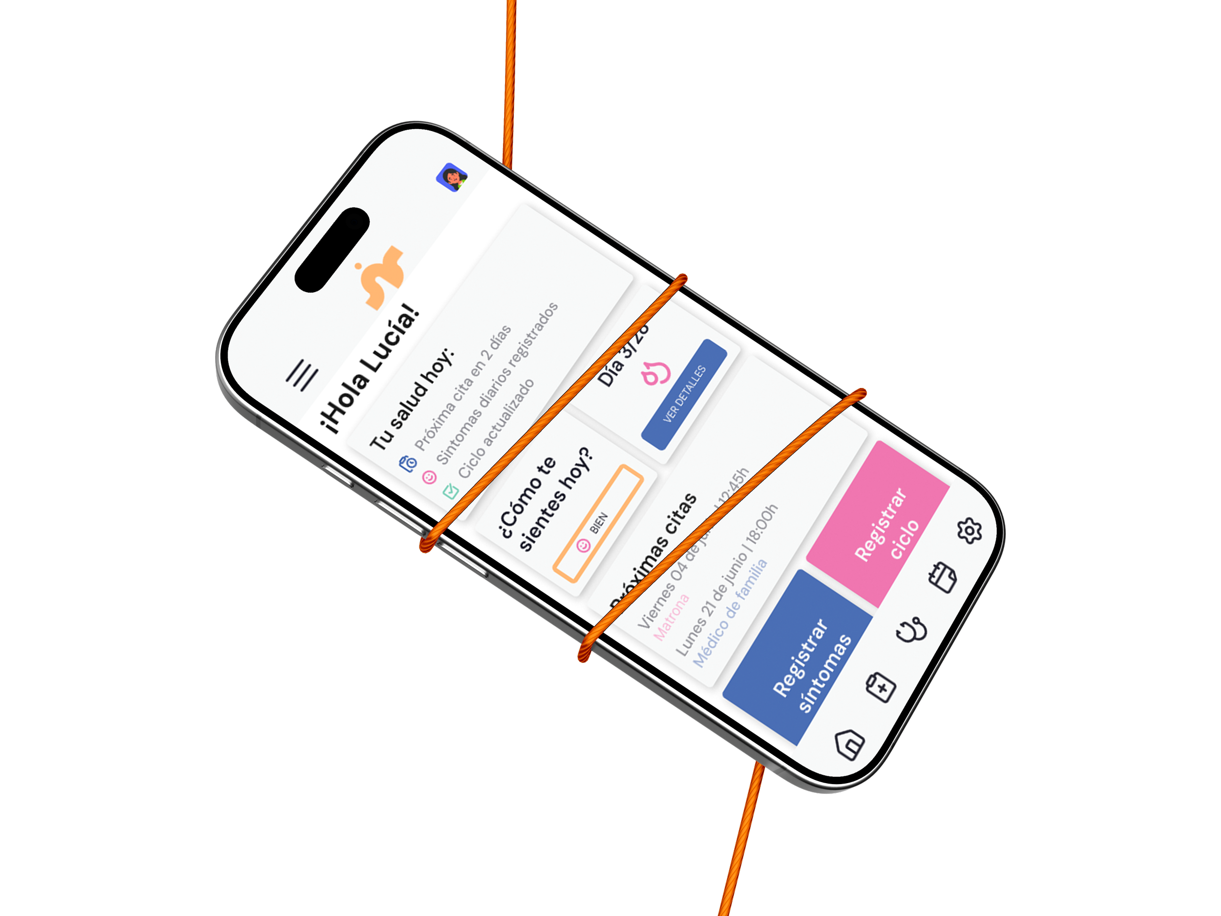
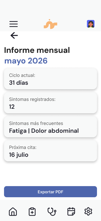
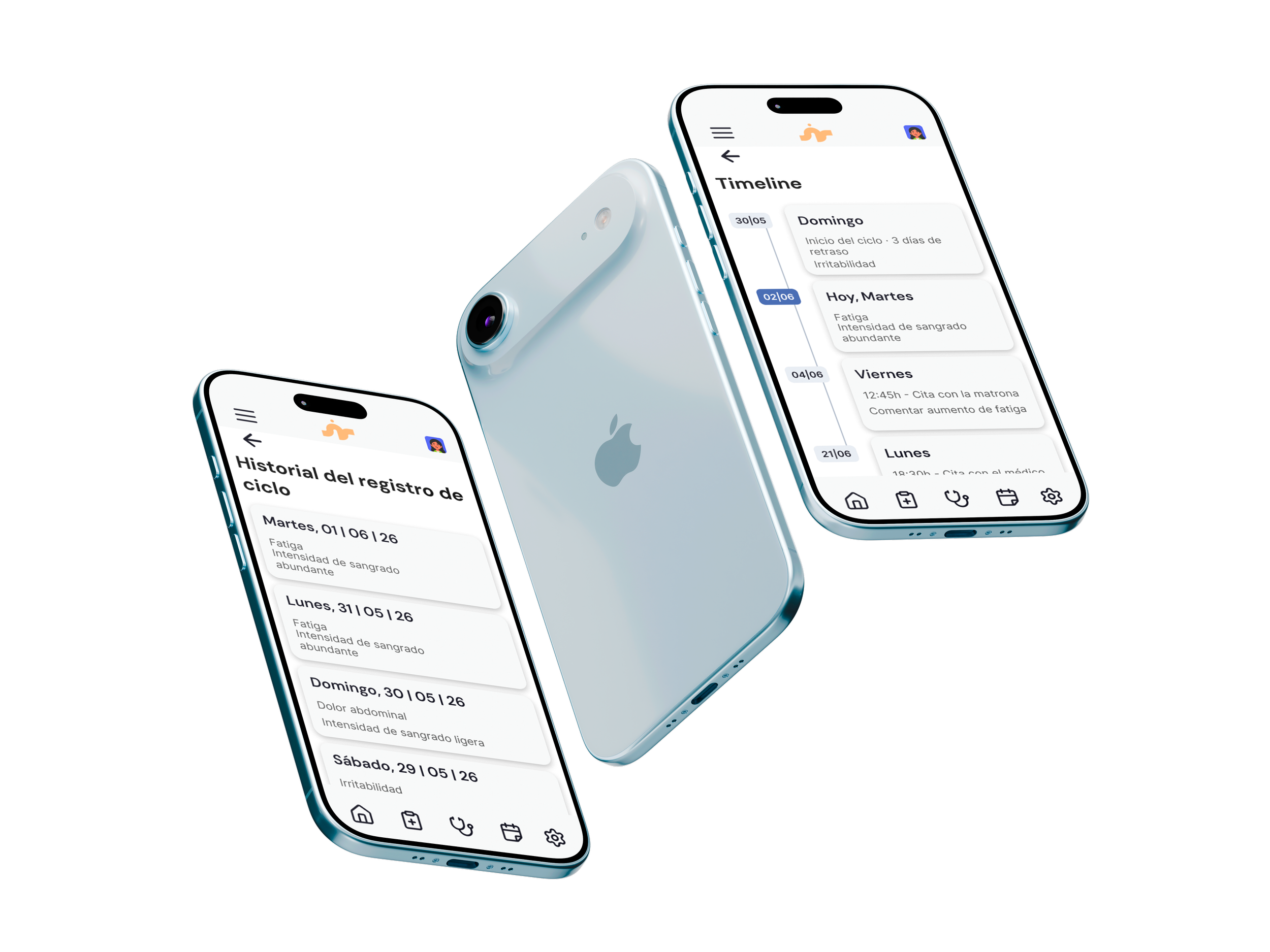
The final screens cover the full flow for Lucía: onboarding, the personalized dashboard, the Salud Mujer section with calendar and cycle registration, the monthly health report, and PDF export.
Two reviews,
two blind spots
Once the project was finished, I asked two people to review it. Each of them caught something I'd stopped seeing.
Round 1 · Readability
A senior designer pointed out text and buttons that were too small, and a logo squeezed against the edge of the header. The uncomfortable part: it was the same problem I'd criticized in other health apps during my competitive audit. So I fixed it the way I'd asked them to: bigger type, bigger buttons, enough contrast to read without squinting, and every card lined up on the same grid.
Before
After
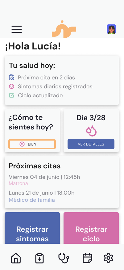
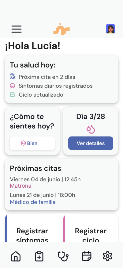
Bigger type and buttons, a logo with room to breathe, and one grid for every card.
Round 2 · Color
My thesis tutor thought the palette was too loud for a national health service. I'd pushed for color on purpose: I didn't want another cold, clinical app. She was right, though, and it didn't have to be one or the other. The app now sits on a calm white base, and every color has one job.
#4E66AD
Actions and today
#D36EA9
Women's health, nothing else
#F8B676
The brand, nothing else
#96CEB7
Confirmations
Before
After
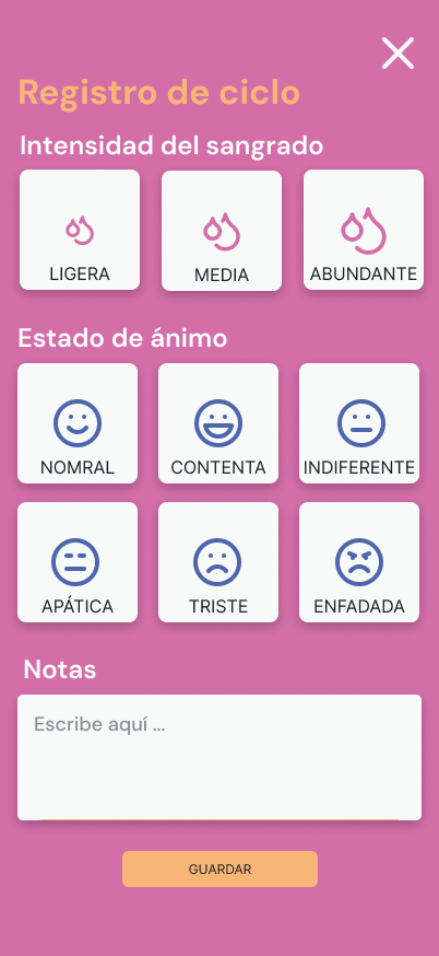
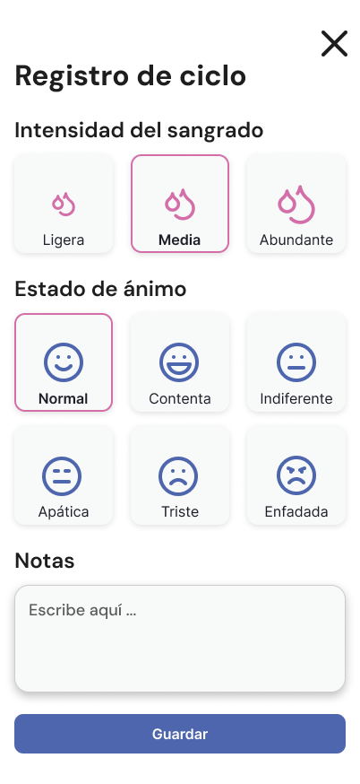
Every review is data. The more of it you gather, the more you see what you missed.
Outcome & Reflection
This project didn't reach real users, so there's no usage data to report, but the decisions themselves make the stakes clear. This is a system meant to serve people at their most vulnerable, someone who just lost the family member who used to manage their care, someone confused about her own body, and design failures here aren't just inconvenient, they're the difference between someone staying connected to their healthcare or falling through the cracks.
If this reached real users, the two numbers I'd watch first are onboarding completion rate among older adults specifically, since that's the population most at risk of being excluded by a "digital-first" health system, and return usage of the Salud Mujer section, since that's the gap this project was built to close.
“Designing for a public health system means designing for the day someone stops being able to do it alone.”