COTA
Role
Editorial Designer · Art Director · Visual Designer
Overview
COTA is an editorial magazine project focused on women who have transformed architecture across past, present, and future generations. Through symbolic compositions, structured layouts, and contemporary editorial design, the project explores themes of evolution, identity, and representation while creating a cleaner and more human perspective on architecture.
The Problem
Many architecture magazines focus heavily on buildings and technical content while giving little visibility to the women behind architectural innovation.
Most publications also rely on rigid layouts and cold visual systems that make architecture feel distant and inaccessible. The challenge was creating an editorial experience that felt:
more human
more contemporary
visually expressive
and culturally meaningful.
The project also explored how editorial design could communicate social change through composition, symbolism, and color rather than only through text.
The Solution
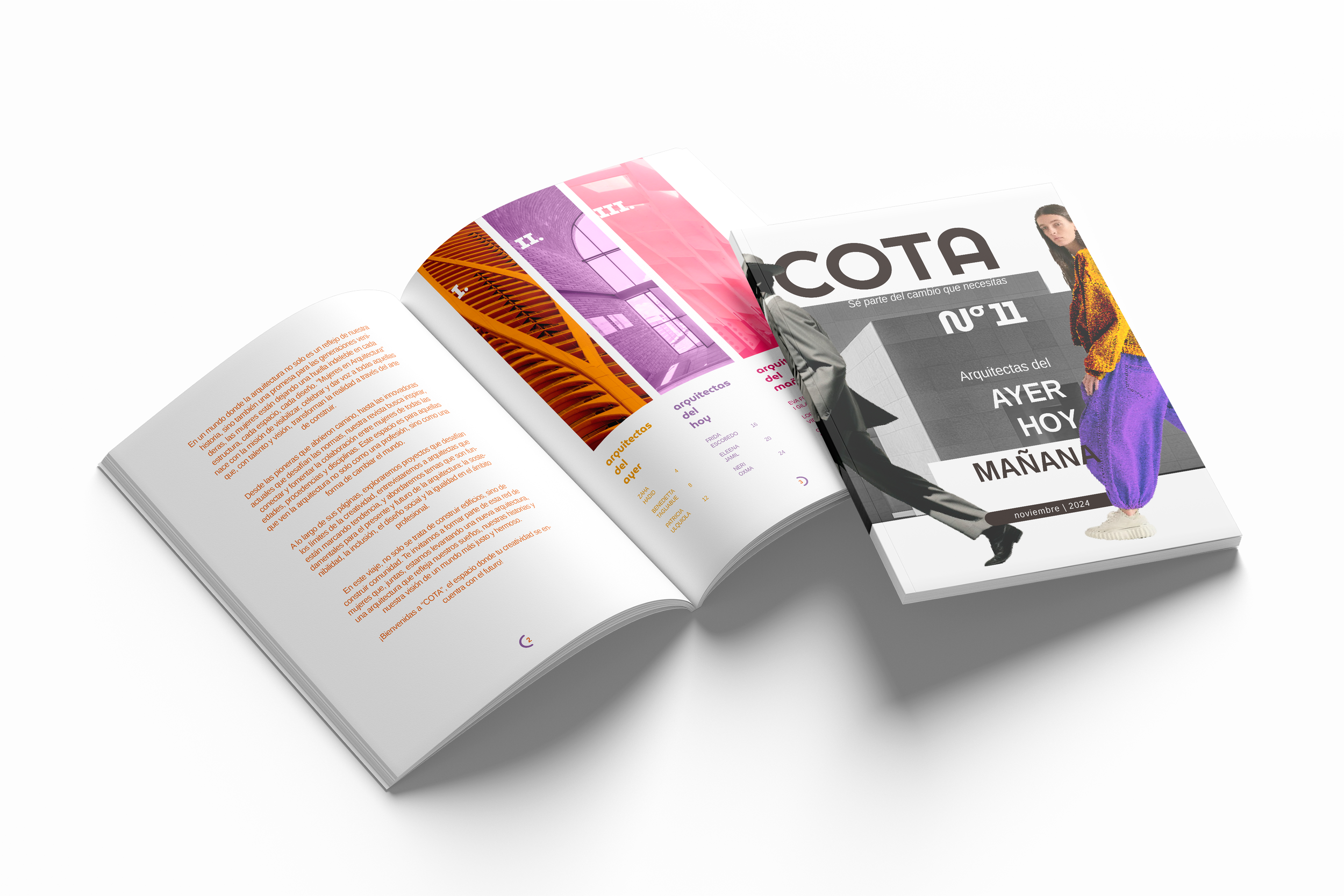
COTA was designed as a conceptual editorial system combining structured layouts with symbolic visual storytelling.
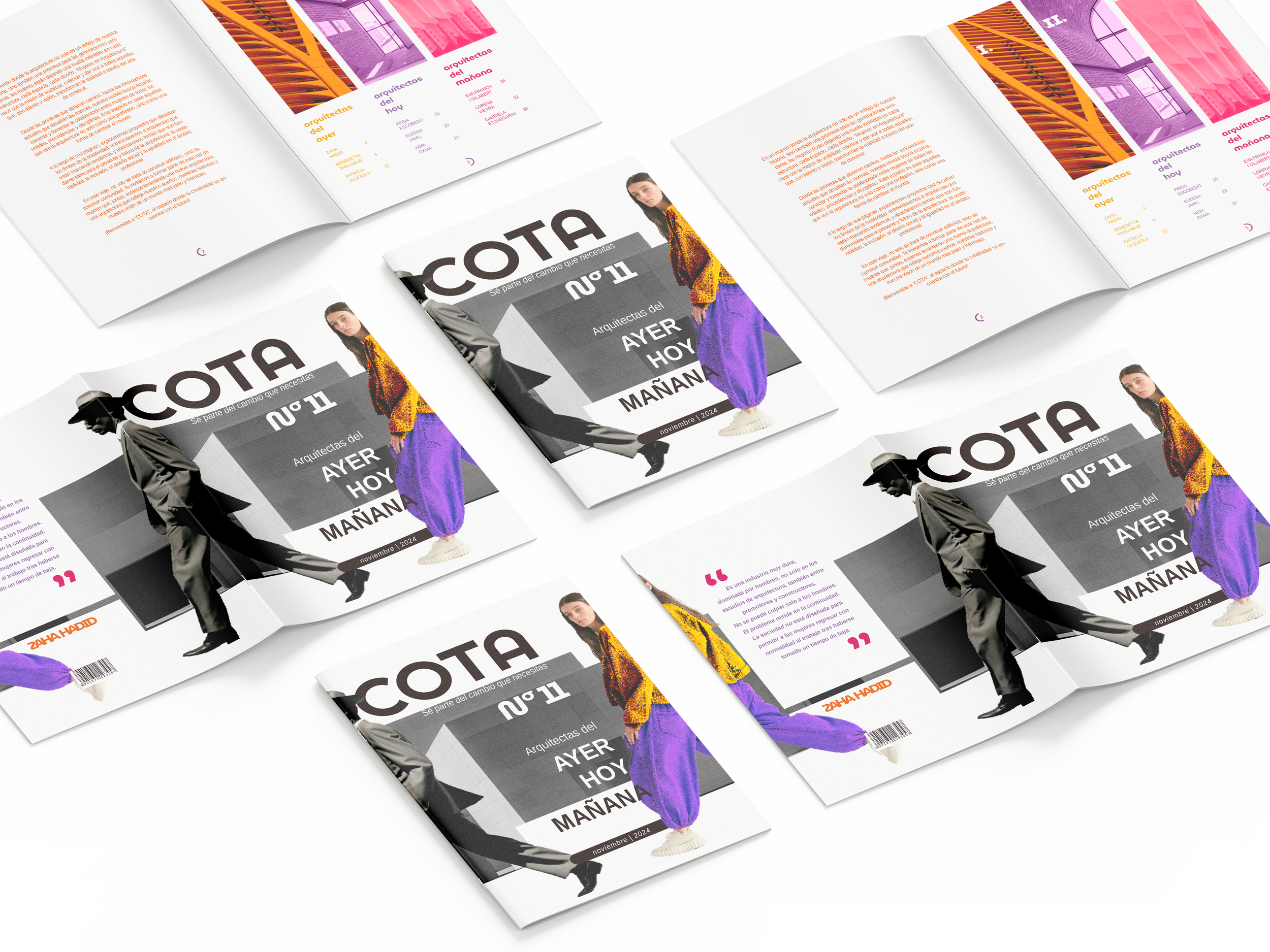
One of the main visual concepts features a grayscale woman walking toward the right while leaving behind a vibrant trail of color. This composition represents the evolution of architecture through the impact and progression of women within the industry.
The project combines:
asymmetrical grid systems
strong typography hierarchy
isolated architectural imagery
grayscale compositions
and vibrant accent colors.
The goal was creating a magazine that feels both editorially refined and emotionally expressive.
Visual System & Editorial Experience
The visual identity combines grayscale photography with vibrant color accents to represent transformation, progression, and creative change.
The editorial system uses:
Liberation Sans Narrow
Museo Moderno
asymmetrical grids
strong contrast
and structured whitespace.
Architectural images were edited and isolated to reduce visual noise and maintain consistency across the publication.
The editorial system was designed to balance structure and expression.
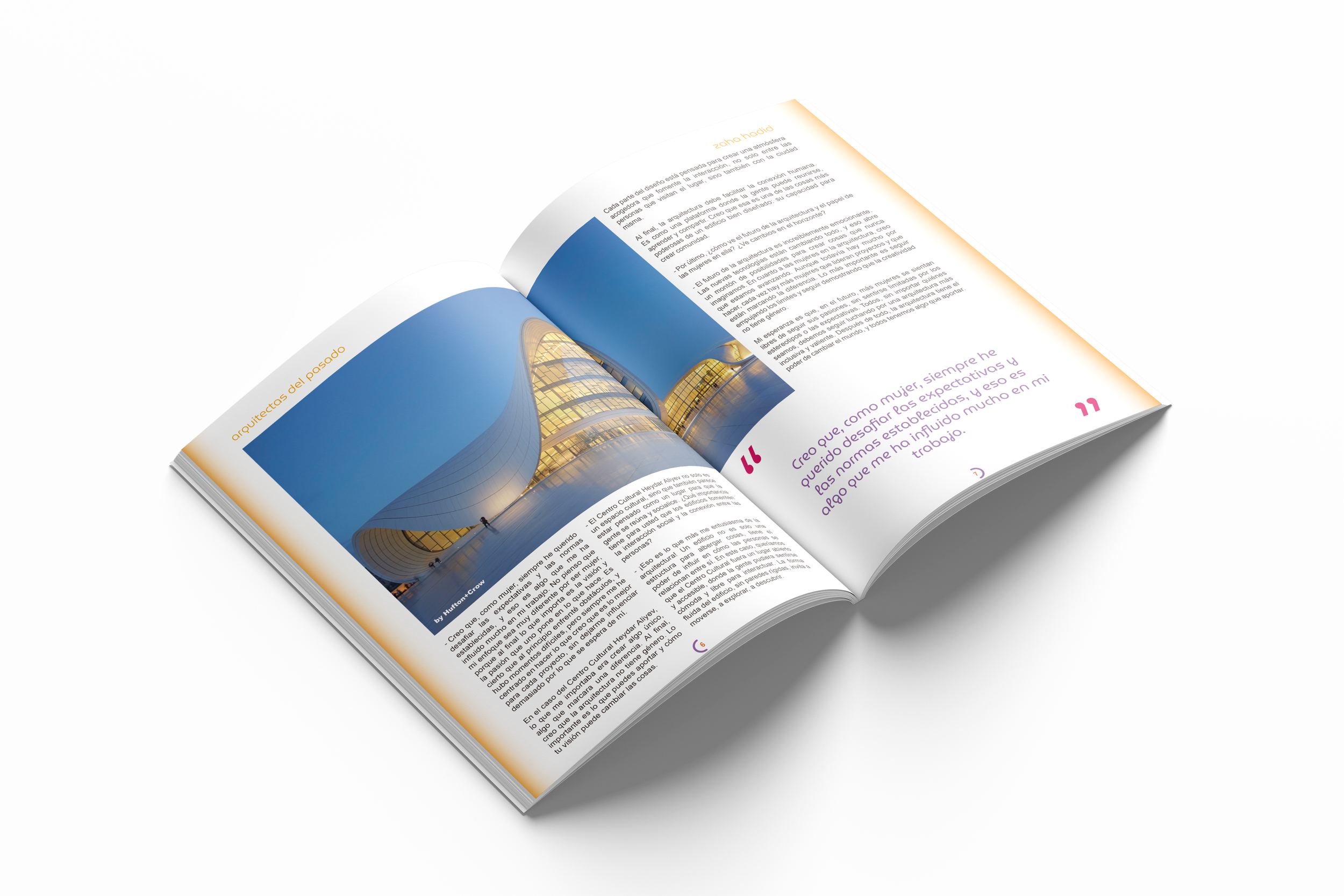
Layouts use asymmetrical vertical axes, generous spacing, and strong typography hierarchy to guide the reader naturally through the content. The combination of minimalist compositions and controlled color usage helps create a cleaner and more contemporary reading experience.
The project intentionally moves away from overly technical editorial styles to create something more approachable and culturally reflective.
Key Features
COTA combines several editorial principles into one cohesive system:
symbolic cover storytelling
editorial spreads
quote compositions
asymmetrical grids
typography hierarchy
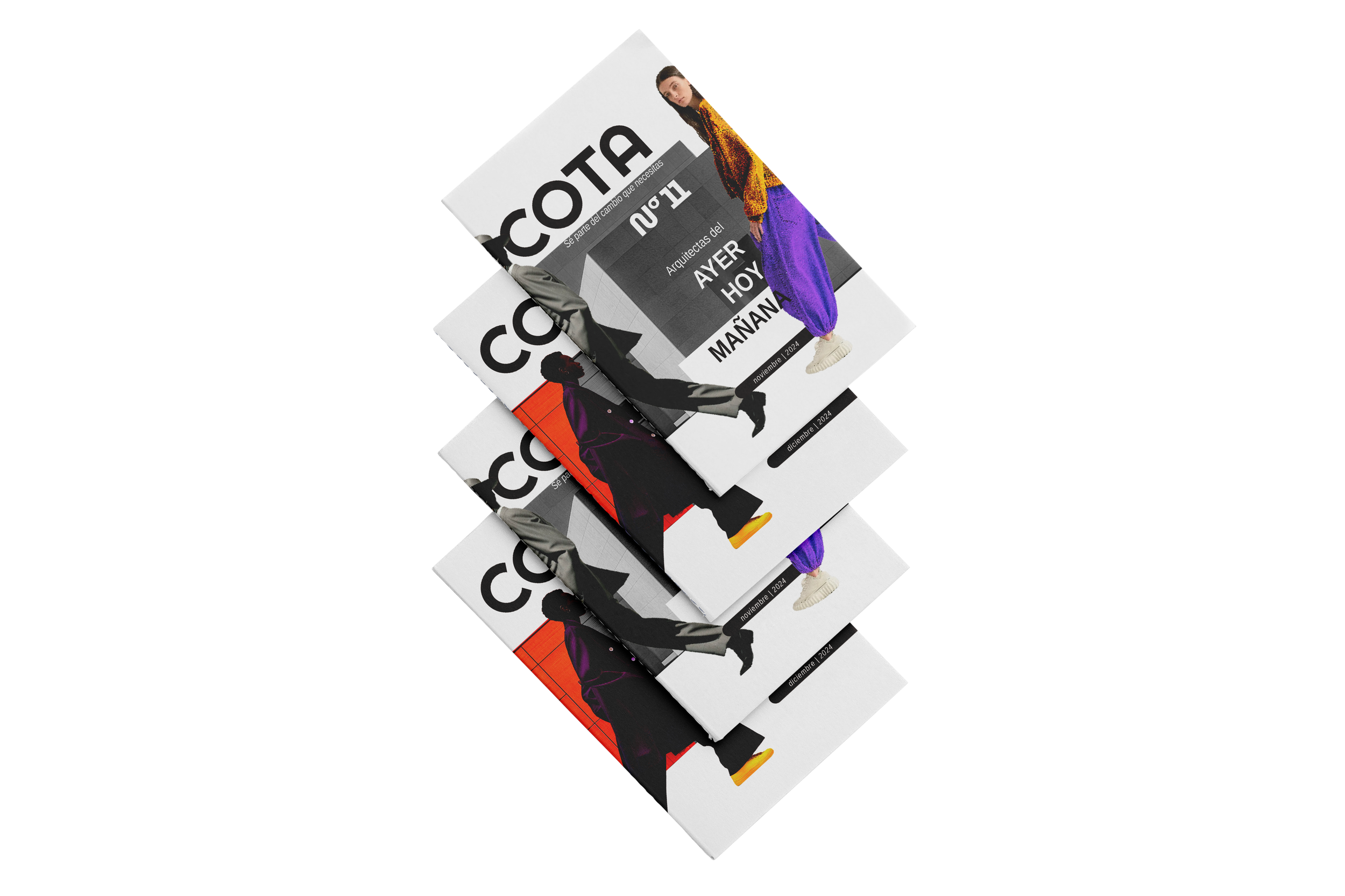
visual continuity between covers
conceptual use of color
Together, these elements create a publication that feels both conceptual and visually structured.
Outcome
COTA reimagines architecture publishing through a more human and visually expressive perspective. By combining editorial systems with conceptual storytelling, the project creates a contemporary publication that celebrates the women who have shaped — and continue shaping — the future of architecture.